Overview
ROLE
UI/UX Designer
TOOLS
Adobe Creative Suite (Ai, XD, Id)
Figma
TIME FRAME
5 Weeks
Fall 2020
Project Background
Creating an interface for an area of interest
This project dealt with picking an area of interest and choosing between creating a new digital experience or improving on an existing one. Using directional research and concept development, we were to come up with a solution to our identified problem. I was initially intimidated by this project, since all our UI/UX projects so far have been in tangent with a physical product and this would be the first one I would be doing that would function as a stand alone interface.
Cadenza
Giving power back to the creator
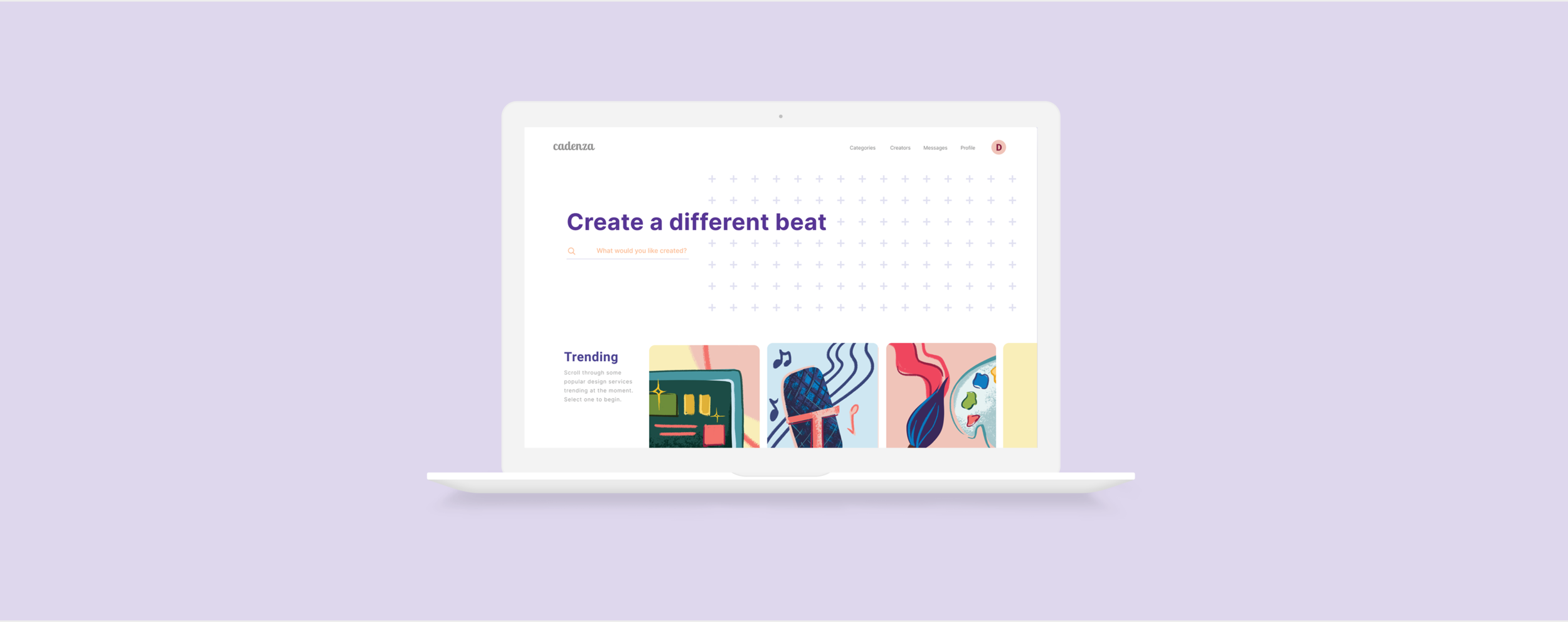
Cadenza is a commission website that aims to ensure both the client and creator are considered equal. It ensures that the creator is protected, while providing a satisfying experience for the client.
Commission websites tend to be a buyer’s platform.
As of now, many digital design commissions have been cheapened by the advent of online commission websites. These websites operate as a buyers market— protecting and giving too much power to the client, and causing the creator to inevitably suffer.
Primary Research
Sending surveys to buyers and creators
For my initial research, I sent out two surveys—one for the buyers and one for creators. Twenty-five people answered in total, with 14 of them being buyers and 11 of them being creators. Some key findings included concerns both user groups had regarding commissions as well as means through which clients find creators.
Survey for Clients
Survey for Creators
Journey Map
Based off the surveys and following interviews, I created a creator-specific persona since I wanted to ensure my solution addressed their concerns. A journey map highlighted key pain-points in the creator’s commission creation process, and helped me find opportunity areas for my solution.
Market Research
Finding the Market Space
Since there are an abundance of Freelance websites on the market, I created a small competitor analysis table with five of the most popular platforms. After mapping them out on a 2x2 matrix, it was clear that there was a need for a platform aimed towards Creator Protection with their commissions being valued at a fair market price.
Key Insights
BUYER’S MARKET
Most commission websites are a buyer’s market. The creator usually always has the short-end of the stick, resulting in them eventually leaving and relying on social media.
CHEAPENING ART
These websites have a reputation for “cheapening art” as creators under-charge themselves, and a few bad eggs plagiarize other creators to make a quick buck.
COMMUNICATION ISSUES
Difficulty in communicating with client results in sub-par work, but since the client is able to drop anytime during the process, the creator is left in a vulnerable position.
Ideation
Resolving issues through User Feedback
I started out creating the user flow through sticky notes. Roughly mapping out the journey helped me ideate various ways to resolve the pain points. The users I tested these journey flows on strongly wanted a section to promote new creators, and have an area to aid in communication between client and creator. I used their comments to finalize my user flow and create my wireframes.
Using Sticky Notes to map out a flow
Wireframing
Finalizing the experience
I wireframed the key interactions of my website and planned out the layout of the media. This was somewhat challenging to do, as I kept trying to stuff more and more functions in, which only ended up confusing my users when they tested it out. Here is the finalized wireframes, and then it was time to create the high-fidelity models!
Branding
Bubbly and Eclectic
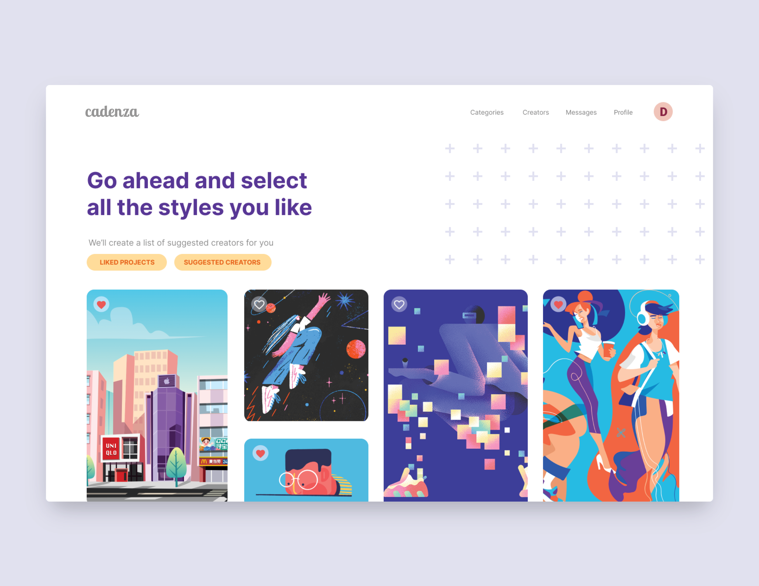
I knew I wanted this website to have bold pops of colors, with a mixture of styles and a cramming of patterns. I chose the name “cadenza” since I thought it was a wonderful way of showing how the client trusts the creator to make their dream come true. I based the illustrations drawn for the website off of the style guide.
Final Solution
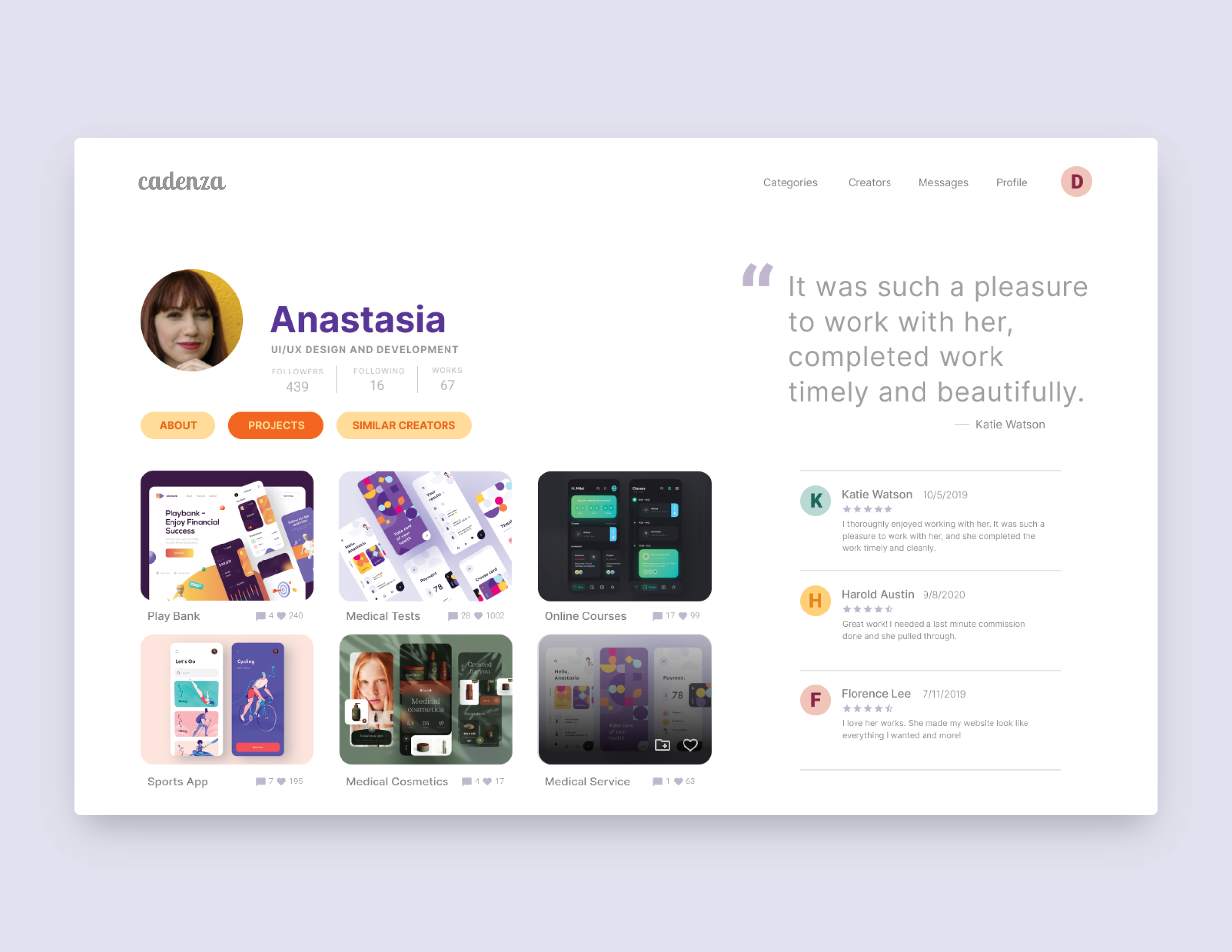
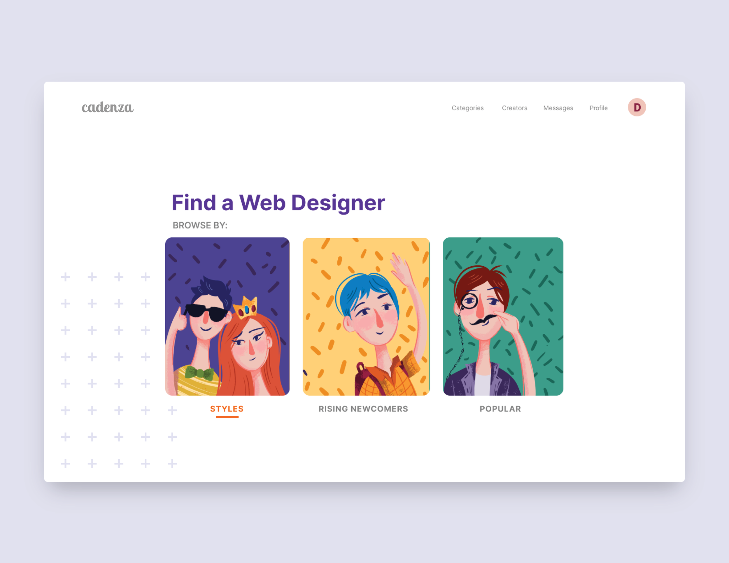
Search Page
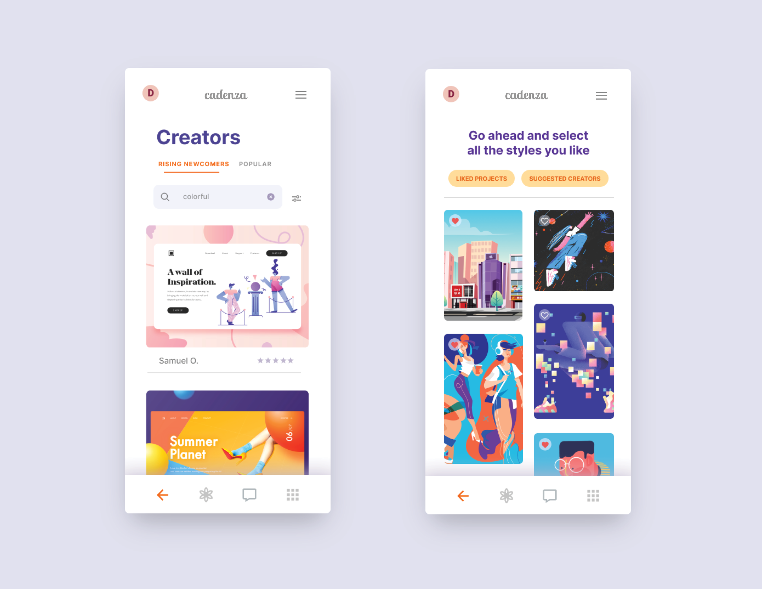
I placed the tabs for “Rising Newcomers” and “Popular” creators side-by-side to ensure newcomers would get the best chance at gaining traction. I added filters for Last Activity, Made With, and Timeframe to aid in the creator selection.
Services in Progress
The hardest part of commissioning is often knowing when to turn away clients. Keeping their limits in mind ensures that the clients the creators do take on are given their full attention and their best quality of work. I added a “Services in Progress” section so that creators can place a visible limit on the projects they are willing to take on, and do not have to reject clients themselves. This ensures no bridges are burnt.
Agreement Page
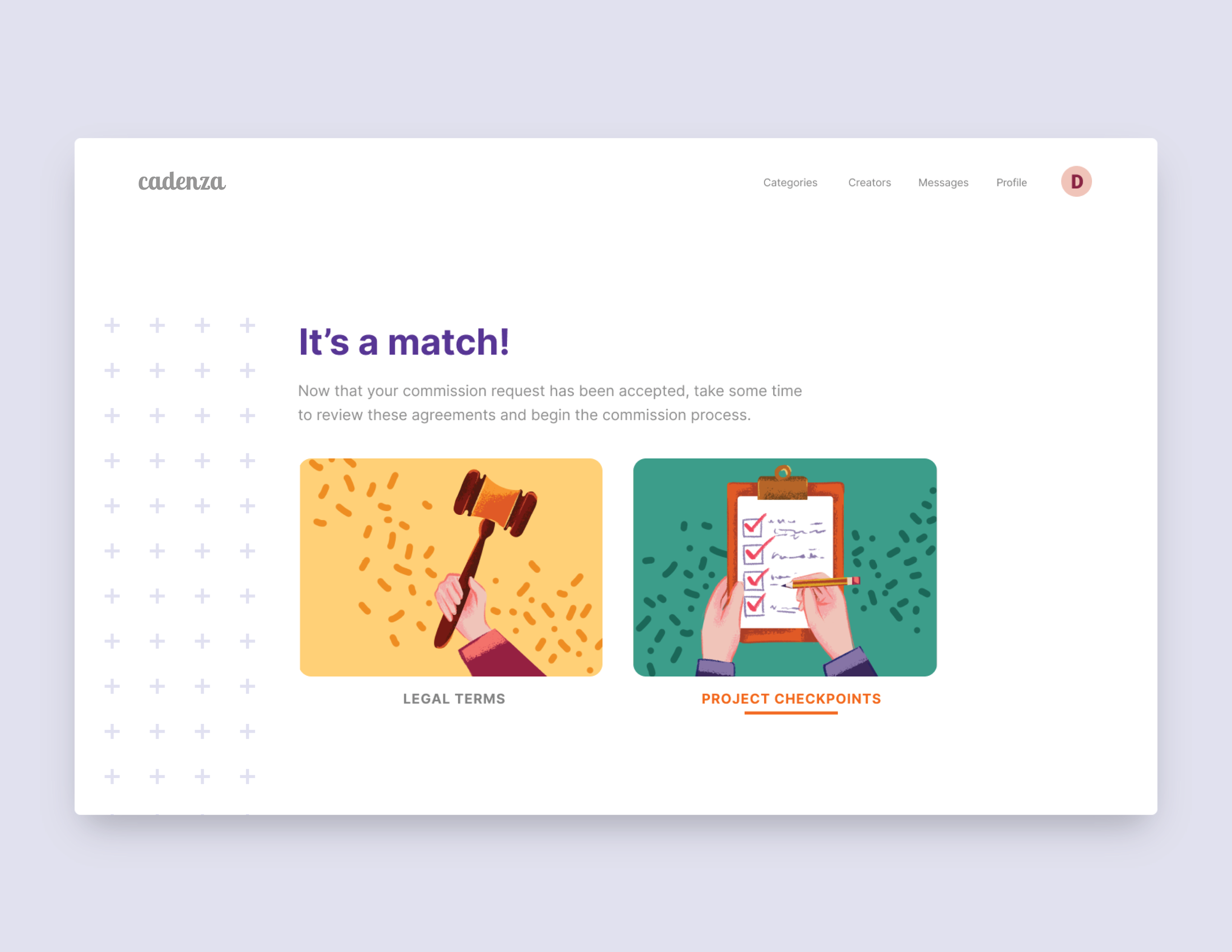
Disagreements during commissioning make the process difficult to get through. I added a “Legal Terms” section and a “Project Checkpoints” sections that both the creator and the client has to go through before beginning the process. The “Legal Terms” section includes an NDA, which the creator must sign, while the “Project Checkpoints” section includes a timeline of all the necessary deliverables during the commission process.
Project Checkpoints
Here, the timeline of the commission’s deliverables is displayed. This prevents any communication issues occurring in the future, as the dates and deadlines are clearly displayed in front of both parties. The creator and client decide when they would like to have any drafts due, meetings scheduled, or any financial checkpoints met.


