Overview
TEAMMATES
Daisy Yin
Hanes Hsu
Chitrita Saxena
AWARDS
Industry Award 3rd Place,
Launchpad PLUS
TOOLS
Machine Shop
Adobe Creative Suite (Ai, Psd, Lr, Id)
TIME FRAME
5 Weeks
Spring 2019
Project Background
Can you combine 4 student styles into a single brand?
This was a project that came as a curveball for most of us. We all had fun making our two (out of three) projects over the spring semester be as wacky and out there as we could. Making a functional piece of jewelry and a felt sneaker? We had a great time, until we realized we had to combine our projects under the same brand for our third project—creating an exhibition design. The exhibition was to be done in a group of four, and is a display of our jewelry and shoe projects. The products were to be displayed along with packaging.
Change is inevitable. Looking back at your life from five years ago, or maybe just even a month ago, you were a different person then and a different person now. Life brings about movement and new experiences, and with that: change. Our brand, Flux, is inspired by this constant ebb and flow of daily life. Many of our products are targeted towards people in different parts of their journeys, but all keeping in mind that they are moving, changing, and stepping into the future.
— FLUX Brand Statement
Concept Development
Focusing on user interaction and experience
Since movement was an integral part of our brand, we wanted the audience to have to move and interact with our exhibit. We added several layers to our exhibition to give different perspectives at different locations of our exhibit. The waves were painted with our signature blue color. When viewed in the front, they appear aligned. This alignment of the waves gives an illusion of continuity. For more process information, check out my Behance page!
Final Design
Reflecting change and movement through flowing lines
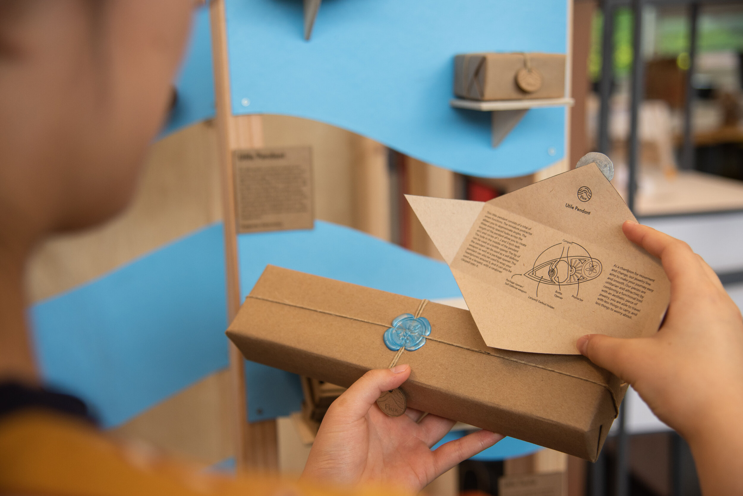
Our concept sketch was a rough idea of the elements in the exhibit and the relative placements. As mentioned before, we added several layers to our exhibition to give different perspectives at different locations of our exhibit. After laying out how we were displaying our products on each layer, we began mapping out dimensions and the scale of the exhibit itself. We also refined the details, as we decided on a pop of blue to add interest from the neutrals of the wood, and to use an undulating wave motif throughout. Small placards would be placed with each project to give the viewer background information on each item.


